In the previous article CSS3 Gradient technique about CSS3 gradient, we learned the basic of gradient techniques in css. In this article we will continue and learn more about CSS3 gradient and specially, CSS3 radial gradient. If you have came directly to this part of the tutorial, we recommend you to take a look at the first part of the article, than refer to this part.
Multi Color Gradient
let’s continue with multi color gradient. It’s pretty simple, after second and third argument for linear-gradient function, add as many color as you want. Here an example
[codepen_embed height=”266″ theme_id=”0″ slug_hash=”jqxBYv” default_tab=”result” user=”Hujjat”]See the Pen <a href=’http://codepen.io/Hujjat/pen/jqxBYv/’>practicing multi color gradient</a> by Hujjat Nazari (<a href=’http://codepen.io/Hujjat’>@Hujjat</a>) on <a href=’http://codepen.io’>CodePen</a>.[/codepen_embed]
If you use rgba color, you can specify the opacity as well. for instance
background: linear-gradient(to right, rgba(255,0,0,0), rgba(255,0,0,1));
Yep, it was all about the basic of linear gradient. now let’s learn radial gradient.
How to Use CSS3 Radial Gradient?
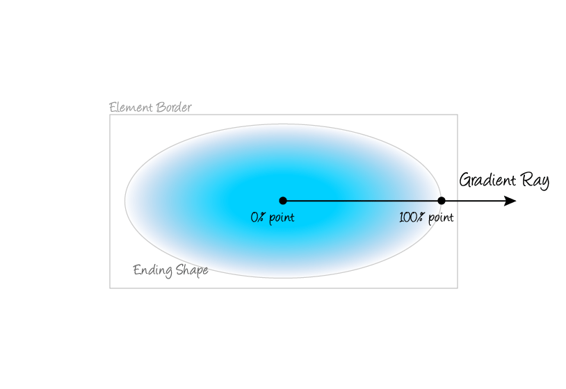
CSS3 radial gradient is like a circle. It start from the center and ends to borders. You can think of center as 0% point, and the border as 100% point.
css3 radial gradient
The first parameter for the radial-gradient function is the shape. the default is ellipse, you can write circle instead. Here is the basic example.
.gradient {
  background-image:
    radial-gradient(
      circle,
      red,
      blue
    );
}
As like linear-gradient, you can add more arguments and more colors.
[codepen_embed height=”266″ theme_id=”0″ slug_hash=”pyVeQG” default_tab=”result” user=”Hujjat”]See the Pen <a href=’http://codepen.io/Hujjat/pen/pyVeQG/’>practicing radial gradient</a> by Hujjat Nazari (<a href=’http://codepen.io/Hujjat’>@Hujjat</a>) on <a href=’http://codepen.io’>CodePen</a>.[/codepen_embed]
Specify the Size
In the above example, the circle of the gradient is out the 300px box. You can give the size value to make it fit on the container. We have different size values. Here are the list.
- closest-side
- farthest-side
- closest-corner
- farthest-corner
You can write them list this
background: radial-gradient(circle closest-side, red, blue, green);
Lastly, if you want to use CSS3 gradient in production projects, make sure you write the prefixes. Here an example for all major browser support.
.technig-gradient {
  background: red; /* For browsers that do not support gradients */
  background: -webkit-radial-gradient(circle, red, yellow, green); /* Safari */
  background: -o-radial-gradient(circle, red, yellow, green); /* Opera 11.6 to 12.0 */
  background: -moz-radial-gradient(circle, red, yellow, green); /* Firefox 3.6 to 15 */
  background: radial-gradient(circle, red, yellow, green); /* Standard syntax */
}
Conclusion
There are a lot to learn about CSS3 gradients, you can search on w3schools for more arguments support. We hope it has been helpful for you. If you have any types of questions related to CSS3 feel free to comment it bellow. 🙂