In the previous tutorial, we have learned the CSS3 2D transition property. This is CSS3 2d transform tutorial, another amazing feature of CSS3. If you master the transform property, you will master the animation world in CSS3. Though transform property is not for animation, it will help you create different effects when using animations.
What is CSS3 Transform?
The transform property allows you to visually change an element by skewing, rotating, translating and scaling. A transformation is an effect that lets an element change shape, size and position. CSS3 supports 2d and 3d transformations. First will learn the CSS3 2D transform and next will go to 3D. But before that, let’s see and example.
[codepen_embed height=”266″ theme_id=”0″ slug_hash=”aNjEVP” default_tab=”result” user=”Hujjat”]See the Pen <a href=’http://codepen.io/Hujjat/pen/aNjEVP/’>Practicing 2D and 3D transform in css3</a> by Hujjat Nazari (<a href=’http://codepen.io/Hujjat’>@Hujjat</a>) on <a href=’http://codepen.io’>CodePen</a>.[/codepen_embed]
CSS3 2D Transform
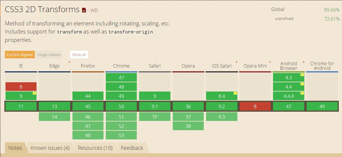
2D transformation let you transform the element in 2D mode. Before we check an example about 2D, let’s see the browser support and general property values.
The following will be the methods for 2D transformation.
translate()rotate()scale()skewX()skewY()matrix()
General Structure – It’s boring to talk about each of the functions separately, so we will give the general structure that will work for all of this functions.
/* Property: values */
transform: none;

/*Property: Function values */
transform: matrix(1.0, 2.0, 3.0, 4.0, 5.0, 6.0);
transform: translate(12px, 50%);
transform: translateX(2em);
transform: translateY(3in);
transform: scale(2, 0.5);
transform: scaleX(2);
transform: scaleY(0.5);
transform: rotate(0.5turn);
transform: skew(30deg, 20deg);
transform: skewX(30deg);
transform: skewY(1.07rad);
transform: matrix3d(1.0, 2.0, 3.0, 4.0, 5.0, 6.0, 7.0, 8.0, 9.0, 10.0, 11.0, 12.0, 13.0, 14.0, 15.0, 16.0);
transform: translate3d(12px, 50%, 3em);
transform: translateZ(2px);
transform: scale3d(2.5, 1.2, 0.3);
transform: scaleZ(0.3);
transform: rotate3d(1, 2.0, 3.0, 10deg);
transform: rotateX(10deg);
transform: rotateY(10deg);
transform: rotateZ(10deg);
transform: perspective(17px);
If you want to give multiple values at the same time, you can do like so.
/* Multiple function values */
transform: translateX(10px) rotate(10deg) translateY(5px);
The global values would be as following.
/* Global values */
transform: inherit;
transform: initial;
transform: unset;
Explanations:
Matrix: To understand the matrix() method, it is best to understand the other four types first. The Other four do as they sound. translate()– move, rotate() – turn round, scale() – scale the size and skew() – will oblique the element.
The remaining functions are matrix and perspective.
matrix(a, b, c, d, e, f) does everything that the previously listed transformation do.
The two arguments, a and d are for scaling the element in the x-direction and the y-direction. It works like scale(a,b) .
The second and third arguments b and c are for skewing the element. The two values work identically to that of the skew(b, c) method.
Lastly, the last two arguments e and f are for translating the element in the x-direction and the y-direction, respectively. Identically to that of the translate(e, f) method.
You can use the matrix() transformation to achieve an incredible effects.
Here is a basic structure.
#element {
     -moz-transform:    matrix(1.4488, -0.3882, 0.3882, 1.4489, 400px, -100px);
     -webkit-transform: matrix(1.4488, -0.3882, 0.3882, 1.4489, 400, -100);
     -o-transform:      matrix(1.4488, -0.3882, 0.3882, 1.4489, 400, -100);
     transform:         matrix(1.4488, -0.3882, 0.3882, 1.4489, 400, -100);
}
Conclusion.
There are a lot to talk about CSS3 2d transform. We will discuss about perspective property in the 3D transform tutorial. We hope you have learned something from this tutorial, if you have any type of question related to CSS3 2D transform or CSS3 in general, feel free to comment it bellow. 🙂