Buttons are one of the most useful components that are being used for various purposes like Showing, hiding submitting and much more. Bootstrap 4 includes several types of buttons which each serving its own semantic purpose, with a few extra functionalities including different colours, different sizes, and different states. let’s find out more about the bootstrap 4 buttons.
Buttons in Bootstrap
Bootstrap 4 has different classes for the buttons that allow us to have control over its colour, state, size. These buttons are normally being used with the <a>, <input> and <buttons> elements but can be used with any elements.
In Bootstrap the .btn class define a button. which are mostly used with the <button> element.
Define a button in Bootstrap as below
<button type="button" class="btn">Button</button>
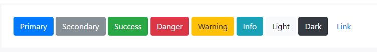
Bootstrap 4 Buttons: Color
Like many other components of Bootstrap 4, the buttons component has different classes for styling the button. It basically includes the following classes for the colours.
<button type="button" class="btn btn-primary">Primary</button>
<button type="button" class="btn btn-secondary">Secondary</button>
<button type="button" class="btn btn-success">Success</button>
<button type="button" class="btn btn-danger">Danger</button>
<button type="button" class="btn btn-warning">Warning</button>
<button type="button" class="btn btn-info">Info</button>
<button type="button" class="btn btn-light">Light</button>
<button type="button" class="btn btn-dark">Dark</button>
<button type="button" class="btn btn-link">Link</button>
The Result will be as the below
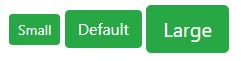
Sizes In Bootstrap 4 Buttons
Bootstrap has it too easy to bring changes to the size or styles of your components. There are 5 available size for the buttons in bootstraps which includes large ( .btn-lg ), Medium ( .btn-md ), Small ( .btn-sm ), and the ( .btn-block ) Block level button which spans the entire width of the parent element.
Note: Bootstrap 4 has dropped the .btn-xs extra small size button.
<button type="button" class="btn btn-success btn-sm">Small</button>
<button type="button" class="btn btn-success">Default</button>
<button type="button" class="btn btn-success btn-lg">Large</button>
<button type="button" class="btn btn-primary btn-block">Block Level button </button>
States of Buttons Bootstrap 4
There are two available states in the bootstrap, the active state, and the disabled state.
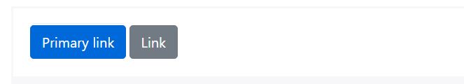
1- Active state:
In the Active state, the buttons will appear pressed ( darker ). you can define it with the .active class followed by aria-pressed=” true” attribute.
<a href="#" class="btn btn-primary btn-lg active" role="button" aria-pressed="true">Primary link</a>
<a href="#" class="btn btn-secondary btn-lg active" role="button" aria-pressed="true">Link</a>
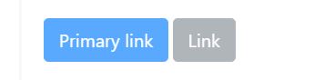
Disabled state
The Disabled state is being used to look inactive. for the buttons, you don’t need to define a .dsabled class, but for the buttons with <a> elements its different, you should use the .disabled class to make it look disabled.
<button type="button" class="btn btn-lg btn-primary" disabled>Primary button</button>
<!-- Link Disabled  --->
<a href="#"class="btn btn-secondary btn-lg disabled" role="button" aria-disabled="true">Button</a>
Bootstrap 4 Outline Buttons
Do you like me and many others like buttons with hefty background colours? fortunately bootstrap has brought us the .btn-outline classes to remove background images and colours of any buttons.
to to define an outline button, just add the .btn-outline classes to your buttons classes as below.
<button type="button" class="btn btn-outline-primary">Primary</button>
<button type="button" class="btn btn-outline-secondary">Secondary</button>
<button type="button" class="btn btn-outline-success">Success</button>
<button type="button" class="btn btn-outline-danger">Danger</button>
<button type="button" class="btn btn-outline-warning">Warning</button>
<button type="button" class="btn btn-outline-info">Info</button>
<button type="button" class="btn btn-outline-light">Light</button>
<button type="button" class="btn btn-outline-dark">Dark</button>
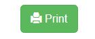
Using Icons With Bootstrap 4 Buttons
    <a href="#" class="btn btn-success btn-lg">
      <span class="glyphicon glyphicon-print"></span> Print
    </a>
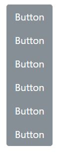
Grouped Buttons
Display a series of buttons with .btn inside the .btn-group as below:
- Use the class .btn-group-vertical to create a vertical button group.
- Add the class .btn-group-* to control the size of your grouped buttons.
Conclusion
That’s it about the Bootstrap 4 buttons. This article is a comprehensive guide about the Bootstrap 4 buttons. If you are interested to learn more about details of the bootstrap Components and find out more about bootstrap 4 read the bootstrap 4 documentation through their website.