In previous article, we discussed about the 2D transform in CSS3. This article is all about 3D transform. In 2009, the WebKit development team proposed a new extension to CSS that would allow Web page elements to be displayed and transformed on a three-dimensional plane(3D). This proposal was called 3D Transforms. CSS3 3D transform start from that time. Nowadays, CSS3 3D transform is support is most major browsers. Before we start learning the 3D transform, Lets see a few examples.
CSS 3D Solar System
by Julian Garnier
[codepen_embed height=”439″ theme_id=”0″ slug_hash=”idhuG” default_tab=”result” user=”juliangarnier”]See the Pen <a href=’http://codepen.io/juliangarnier/pen/idhuG/’>CSS 3D Solar System</a> by Julian Garnier (<a href=’http://codepen.io/juliangarnier’>@juliangarnier</a>) on <a href=’http://codepen.io’>CodePen</a>.[/codepen_embed]
3D CSS Typography
by Noah Blon
[codepen_embed height=”416″ theme_id=”0″ slug_hash=”CsxfH” default_tab=”result” user=”noahblon”]See the Pen <a href=’http://codepen.io/noahblon/pen/CsxfH/’>3D CSS Typography</a> by Noah Blon (<a href=’http://codepen.io/noahblon’>@noahblon</a>) on <a href=’http://codepen.io’>CodePen</a>.[/codepen_embed]
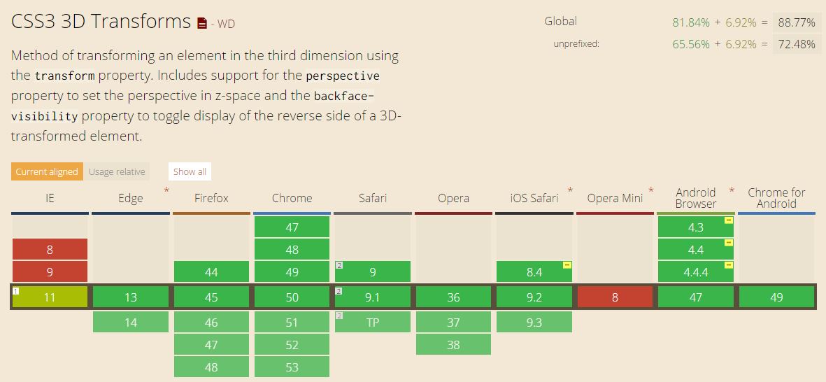
CSS3 3D Transform Browser Support
The browser support for 3D transform is good enough. It means, IE 11 support it with prefixes. Here is the caniuse.com browser support table.
3D Transformation Functions
The functions for 3D transformation in CSS3 are; translate3d , scale3d , rotate3d , matrix3d and perspective. We will talk about each of them separately.
3D Methods
For translate method, you have multiple options. you can use translateY() to translate the element in Y-axis. You can use translateX() in X-axis. And most importantly, you can use translateZ() axis, which runs front to back in 3D space. Positive values position the element closer to the viewer, negative values far away. Additionally, you can use translate3d() and give all the values at once.
Note: the same thing will work for other three methods as well. Here is an example
translate3d( x, y, z )
scale3d( x, y, z )
rotate3d( x, y, z, angle )
Matrix3d
If you new to matrix method in general, I recommend you to read the article about CSS3 2D transform first. there we explained how matrix work in very easy ways. Martix3d will will work instead of all three other methods. For example.
instead of this using two function like this
transform: rotate3d(1, 0, 1, 45deg) translate3d(24px,25px, 100px);
You can use
transform: matrix3d(0.8535533905932737, 0.4999999999999999, 0.14644660940672619, 0, -0.4999999999999999, 0.7071067811865476, 0.4999999999999999, 0, 0.14644660940672619, -0.4999999999999999, 0.8535533905932737, 0, 22.62994231491119, -20.3223304703363, 101.3700576850888, 1)
In one-line. Looking pretty easy. If you think it is a lot more complicated than first option, you might be confuse about the number values. You never need to write this values by hand. There are some tools that you can use to generate this values. All you do is enter the transformations you want and the click the red button for the tool to generate the equivalent matrix() function for you.
Perspective
The perspective property is used to activate the three-dimensional space on an element so that its children can be positioned in that space. You can use it in two different ways. Using it as method or as property.
Example used as method.
transform: perspective( 700px );
Used as property.
perspective: 600px;
Here is a live example.
[codepen_embed height=”494″ theme_id=”0″ slug_hash=”pyOYJB” default_tab=”result” user=”Hujjat”]See the Pen <a href=’http://codepen.io/Hujjat/pen/pyOYJB/’>Practice Perspective in css</a> by Hujjat Nazari (<a href=’http://codepen.io/Hujjat’>@Hujjat</a>) on <a href=’http://codepen.io’>CodePen</a>.[/codepen_embed]
Perspective-origin
By default, the vanishing point for a 3D space is positioned at the center. (It can be changed using the perspective-origin property.) If the elements don’t share the same three-dimensional space, each of them will have a vanishing point of its own. So, using perspective() will result in each element having its own space and therefore its own vanishing point. In order to avoid this and allow the elements to line up, they should share the same space. By using the perspective property on the container, a three-dimensional space is created that is shared by all its children.
You can specify the origin like so.
perspective-origin: 25% 75%;
Conclusion
Now you have learned how CSS3 3D transform work. You should now play and practice to master. Try to use in in different projects to understand how it function. We have shown you just one usage, but you must search for different examples and see how others use it. Check to last example on github. If you have any question about CSS3 3D transform or any other property, feel free to comment it bellow. 🙂